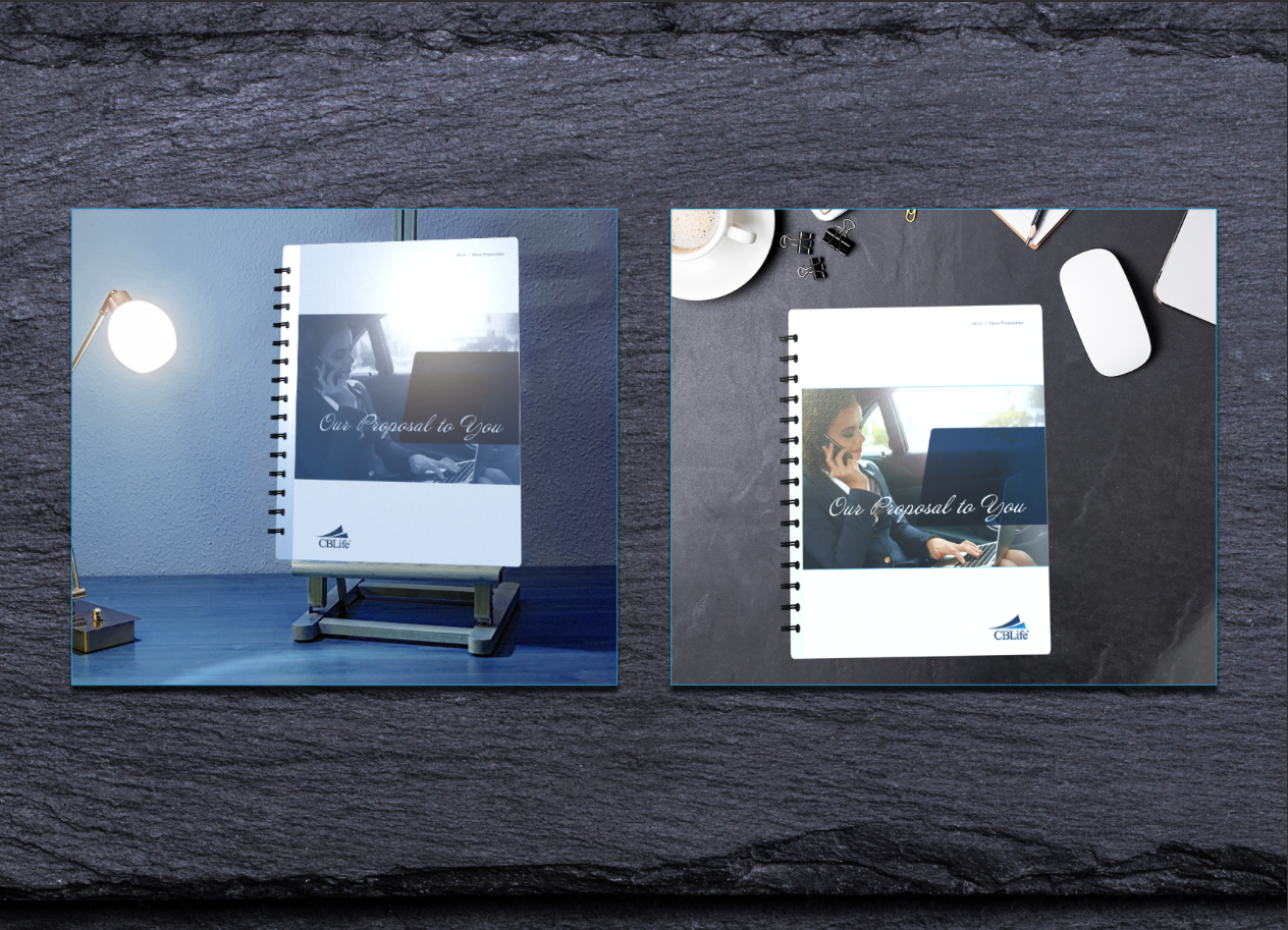
Pitch for sales value proposition specialty booklet: 2 layouts (one with 2 derivatives); aluminum, acrylic & cardstock covers; metal coil binding; quoted metal screw posts with metal hinge & die cuts under budget. (back covers not pitched) Click image above to view additional spreads.
DRAFT—Below: Value Proposition Booklet—Final DRAFT.


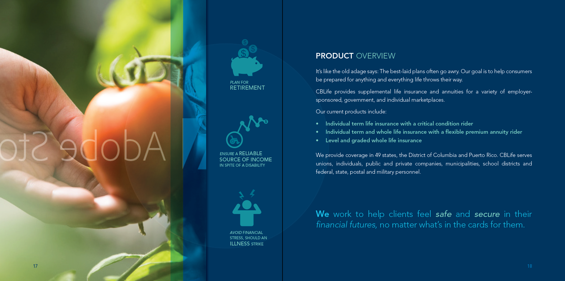

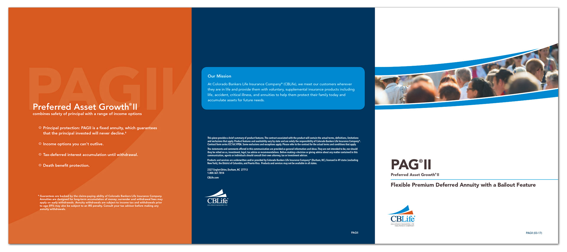
Brochure cover spread
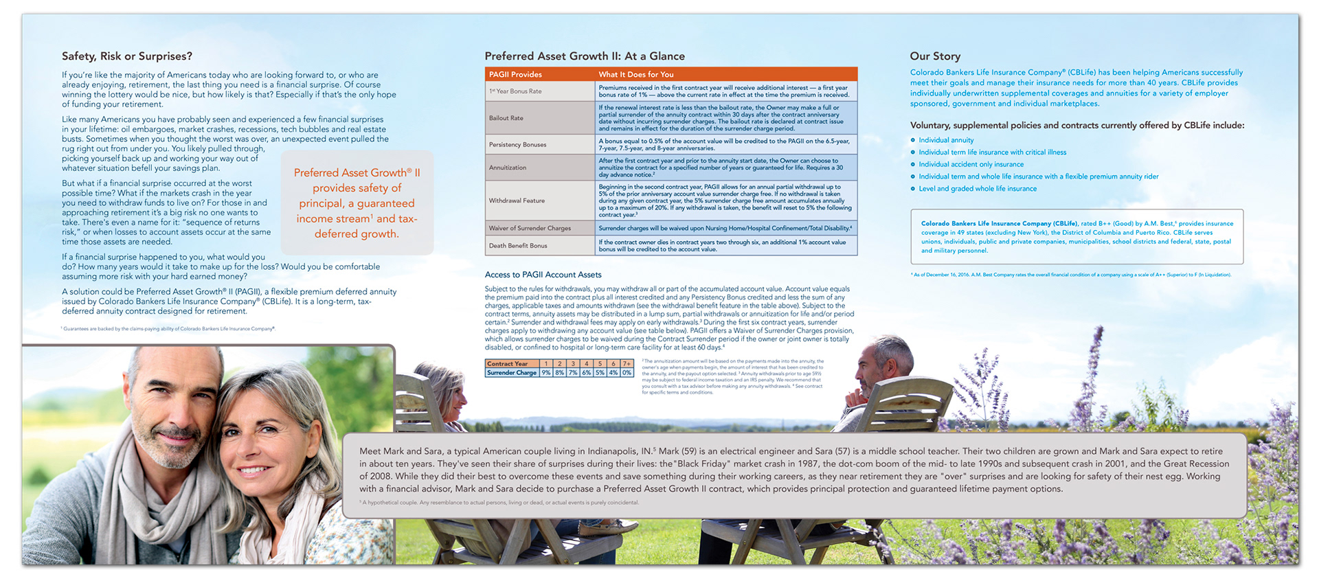
Brochure inside spread
2-sided identity flier

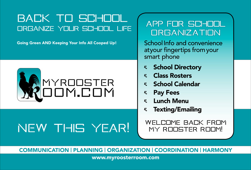
Email blast

Email blast

Email blast

Email blast header

Digital newsletter masthead

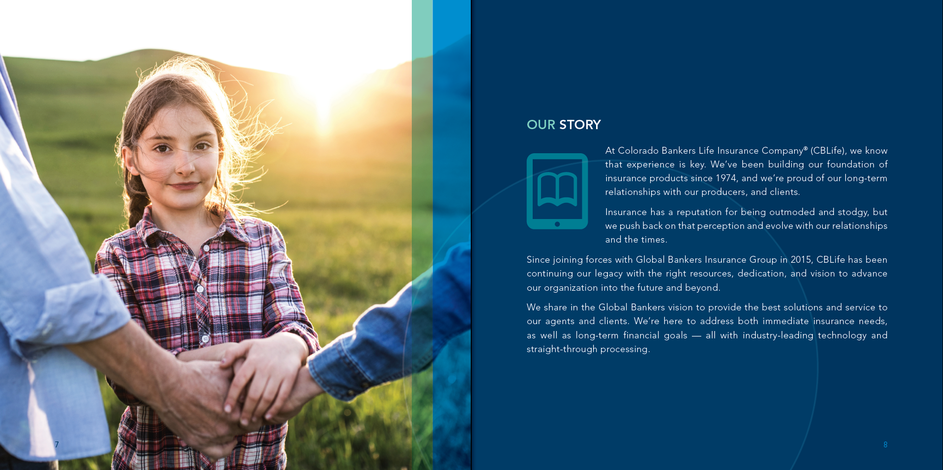
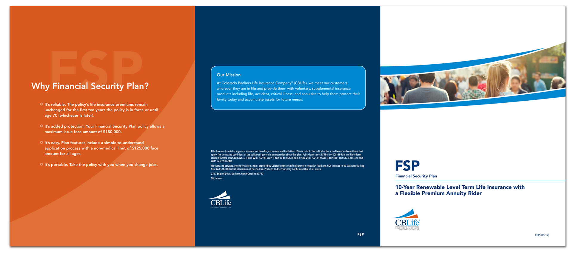
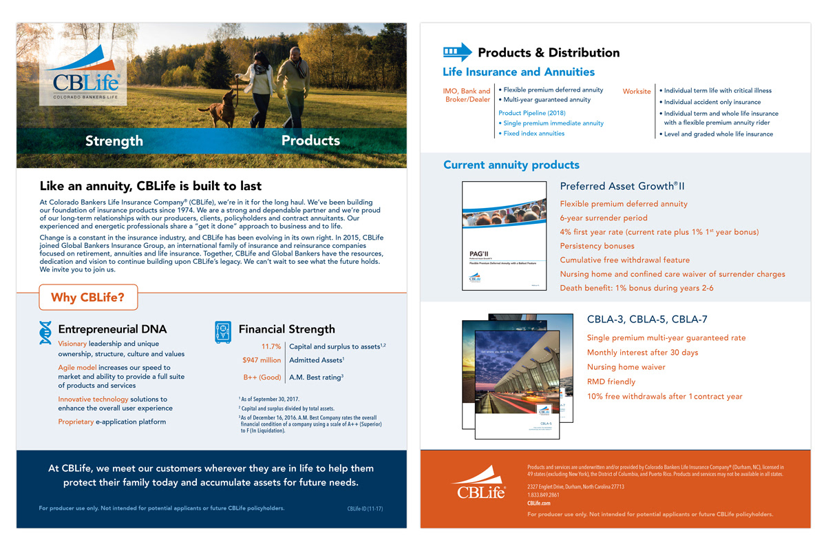
Brochure cover spread
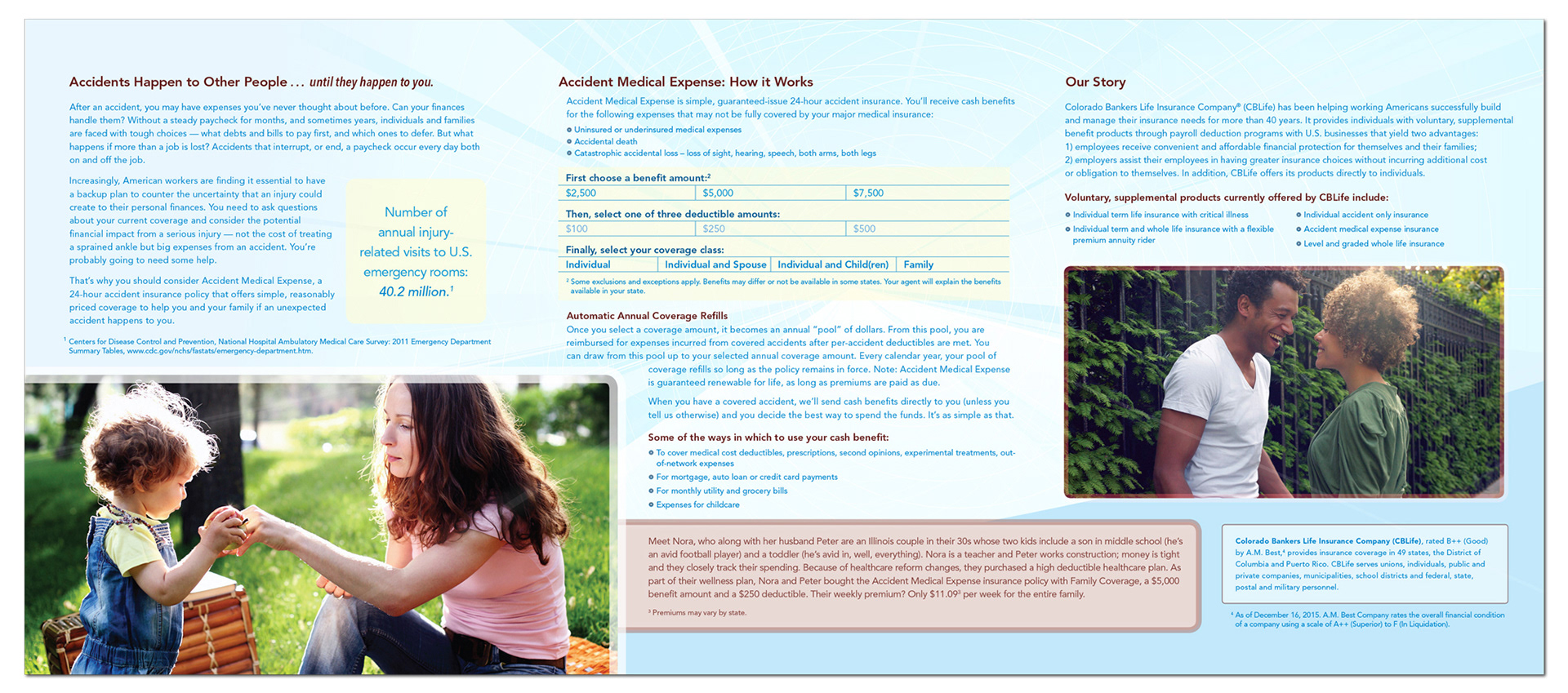
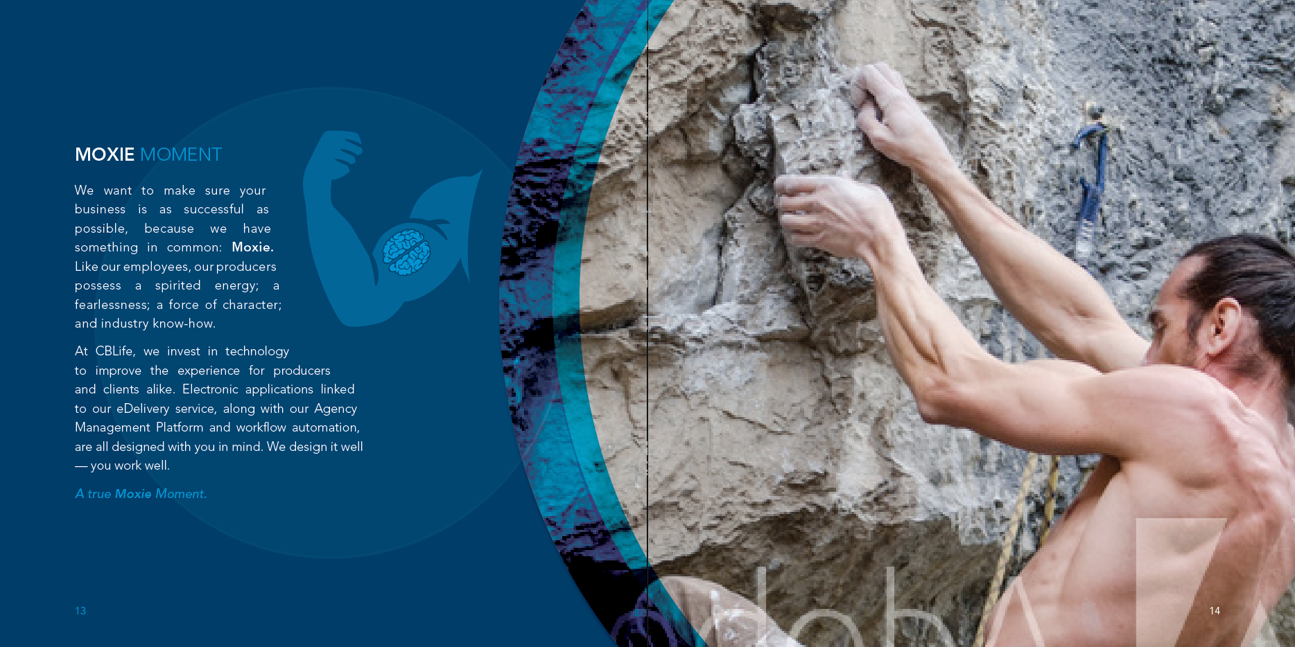
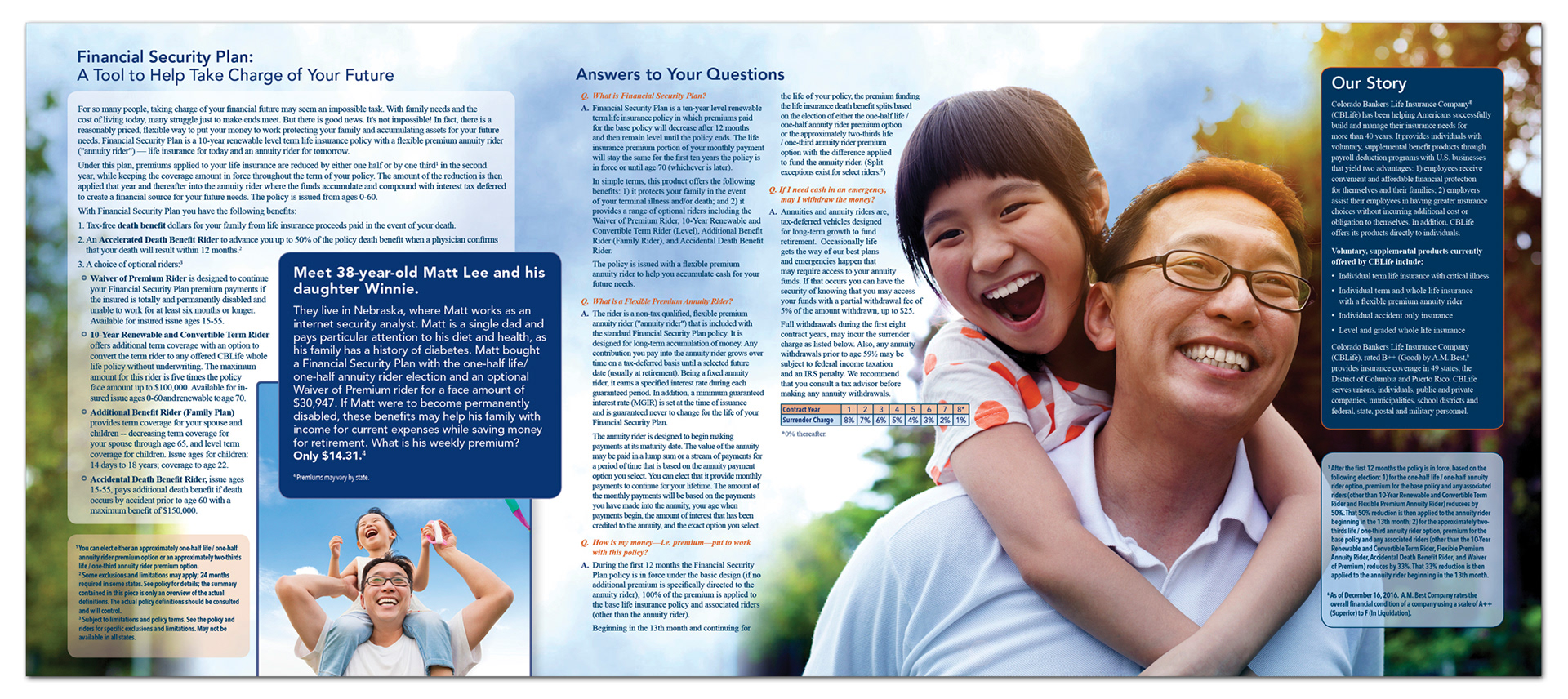
Brochure inside spread
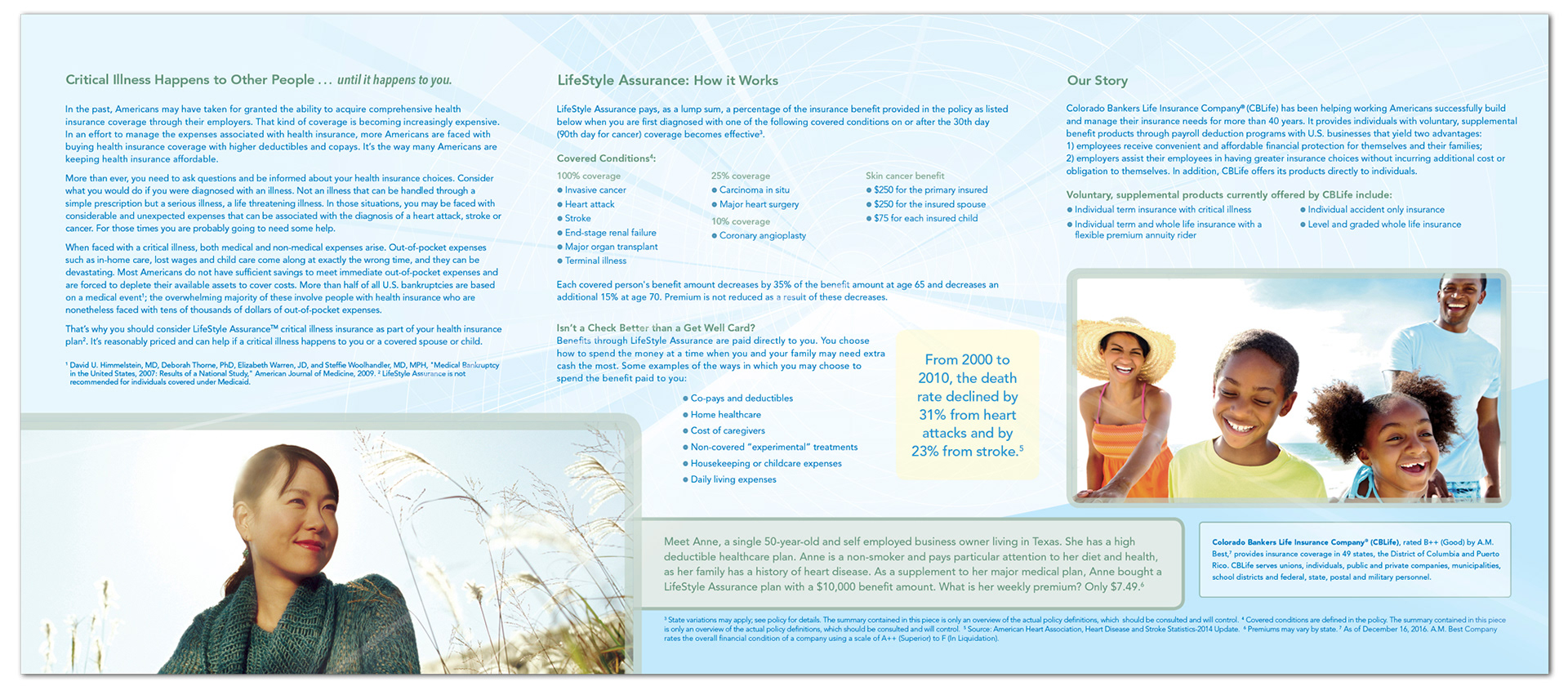
Brochure inside spread
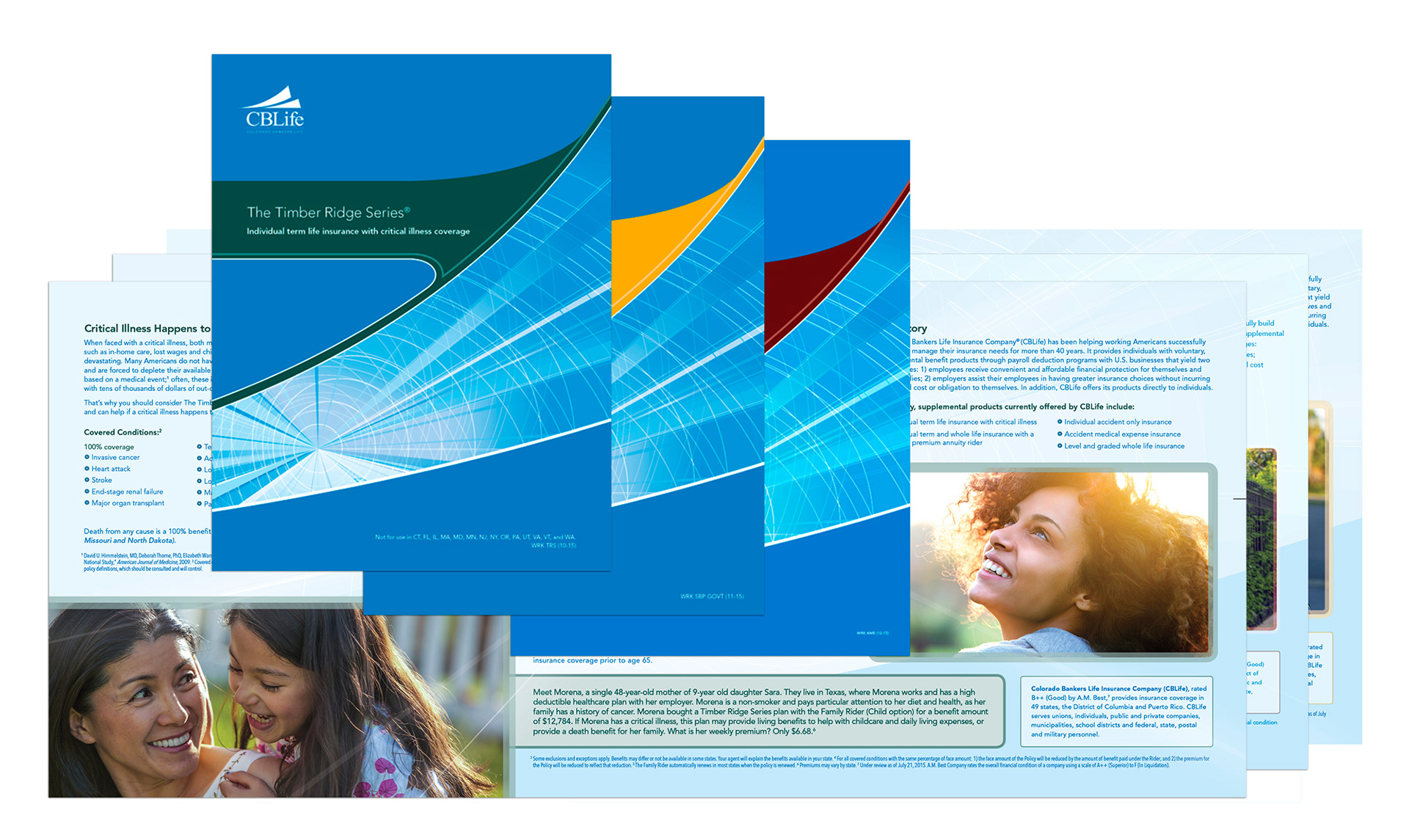
Policy folder that received an Honorable Mention from the Insurance & Financial Communicators Association. Insurance policies are intangible. We wanted to give our consumers something tangible that spoke to the quality and importance of the intangible policy they are financing to protect themselves and their family. So we put a "soft touch" aqueous coating on the flood of blue to speak to their feelings of security now supported by the policy, and to symbolize in a tangible form the quality and importance of our product for them and their family.
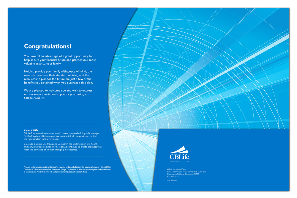
The graphic is complex as it connotes many things. The perspective nature of the illustration represents the policyowner’s and our dynamic future; the circles—subtly—life & balance; and the rays on the right as well as the shape holding the graphic symbolize growth and change, which tie to the company’s future as well as people’s need for insurance. A satin/silk spot varnish was applied to the graphic to gently call attention to this, without the kitschy, garish look a gloss spot varnish may have done.
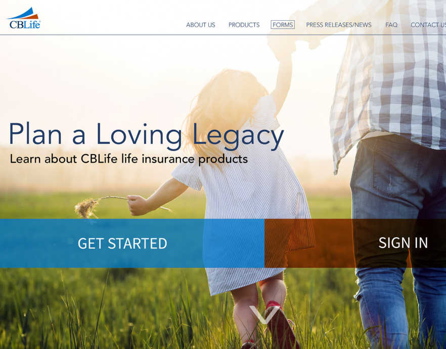
Banner

DVD cover